
Websites & Digital Experiences
Your Website Is Your Professional Signature: What Does Yours Say About Your Business?
A professional business website earns trust before the first conversation. Here is what to look at first, and why a prettier site is not always the fix.
By Jeremy Vetter · 6 min read
Your website may introduce your business before you ever get the chance.
Someone hears your company name from a friend. They see one of your vehicles. They find you on Google. They come across a social post.
What happens next?
There is a good chance they visit your website.
And in a matter of seconds, they begin forming an opinion about your business.
Not simply about the website.
About you.
Is this company established?
Professional?
Current?
Organized?
Easy to work with?
Trustworthy?
That is why I think of a business website as its professional signature.
It is one of the most visible representations of how seriously you take your business.
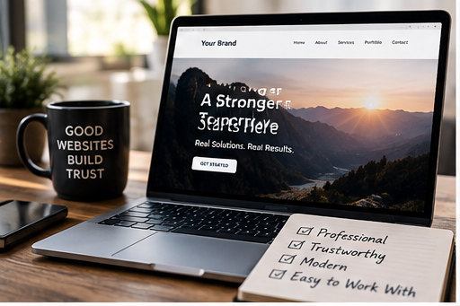
Your website does not have to be extravagant.
One of the biggest misconceptions about web design is that a great website needs complicated animations, dozens of pages, or every new design trend.
It does not.
It needs to make the right things obvious.
A strong website should quickly answer:
- What do you do?
- Who do you do it for?
- Why should someone trust you?
- What should they do next?
If visitors have to hunt for those answers, the design is already creating friction.
The goal is not to make someone say, “Wow, that website has a lot going on.”
The goal is for them to think:
“These people know what they're doing.”
Design affects perceived credibility.
Consumers rarely separate the quality of your website from the quality of your company.
That may not always be fair, but it is reality.
Imagine two businesses offering essentially the same service.
One has a website that loads quickly, works beautifully on a phone, explains the service clearly, uses professional imagery, and makes contacting the business effortless.
The other has outdated photos, broken links, tiny text, confusing navigation, and no obvious next step.
Even before calling either company, which one feels safer?
Your website does not need to make you look bigger than you are.
It should make you look as good as you actually are.
Five things I look at immediately
If you are wondering whether your website is helping or hurting your business, start here.
1. Can someone understand the business in 10 seconds?
Your homepage should not require interpretation.
A visitor should know what you provide, who it is for, and ideally where you serve within the first screen or two.
Clever wording should never come at the expense of clarity.
2. Does the mobile experience feel intentional?
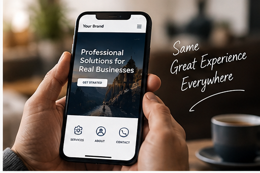
Your mobile website should not feel like the desktop site got squeezed onto a smaller screen.
Buttons need to be easy to tap. Text needs to be readable. Forms should be simple. Navigation needs to work naturally.
Mobile is not the backup version of your website.
For many customers, it is your website.
3. Is there an obvious next step?
Every page should help visitors move forward.
That may be:
Book. Call. Request a quote. Schedule a consultation. View services. Start planning.
Do not make interested customers figure out how to become customers.
4. Does the content sound like your current business?
Businesses evolve faster than websites.
Services change. Audiences shift. Capabilities improve. Pricing models change. Teams grow.
If your business has evolved significantly but your website still describes the company you were three years ago, your online presence is underselling you.
5. Does the experience build confidence?
Look at the entire journey.
- Professional photography.
- Clear language.
- Consistent branding.
- Useful information.
- Fast loading.
- Straightforward forms.
- Thoughtful calls to action.
Individually, these details seem small.
Together, they communicate competence.
A prettier website is not always the answer.
Sometimes the website does not need to be rebuilt.
It needs better structure. Or clearer messaging. Or a stronger mobile experience. Or better calls to action. Or updated imagery.
The right question is not:
“How do we make this website look cooler?”
It is:
“What does a prospective customer need to see, understand, and believe before they are comfortable taking the next step?”
Design around that answer.
A quick website test
Open your homepage on your phone and pretend you have never heard of your company.
Give yourself ten seconds.
Then ask:
Do I know what this company does?
Do I know who it is for?
Do I trust it?
Do I know what to do next?
If any answer is unclear, you have found somewhere to start.
Ready for a second set of eyes?
Vetter Ventures helps businesses create websites and digital experiences that look professional because they are clear, intentional, useful, and built around the customer journey.
If your business has outgrown its website — or you simply are not sure what your online presence is communicating — let's look at it together.
Next step
Contact Jeremy.
Call or text 803.446.6060 for a short, straightforward conversation — no sales presentation. Prefer to write? Send a message and Jeremy will follow up personally.